Eatsa Kitchen Operations App
Role
Lead Designer
For
Eatsa (now Brightloom)
Date
2018
Type
Product Design / SaaS
About Eatsa
Eatsa (now Brightloom) provides automation technology to fast-casual restaurant chains. With Brightloom’s Integrated Kitchen Operations Management Platform, restaurant chains can streamline operations, optimize labor, and increase order throughput with fully integrated and instrumented back-of-house tools.
The Integrated Kitchen Operations application is used by workers and store managers to handle the restaurant order fulfillment process end-to-end. From food preparation to order dispatch, it works in concert with kitchen workers and automated hardware to maximize efficiency and drastically reduce order fulfillment time.
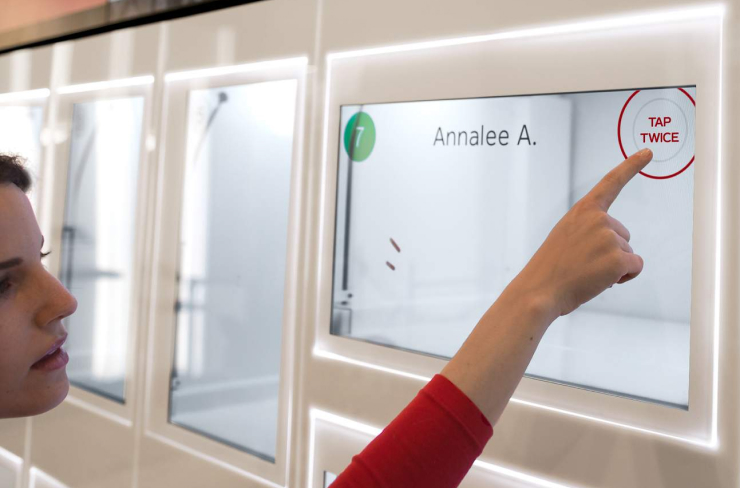
Eatsa's automated pickup system, simplified the dining process with efficient automation.
The redesign reduced average order fullfilment time by 30%.
Project Objective
Improve back-of-house efficiency and reduce order fulfillment time by redesigning the Integrated Kitchen Operations application.
Design Phases
- Customer insights and ideation
- User research and A/B testing
- Visual and interaction design
- Motion and sound design
Usability Research
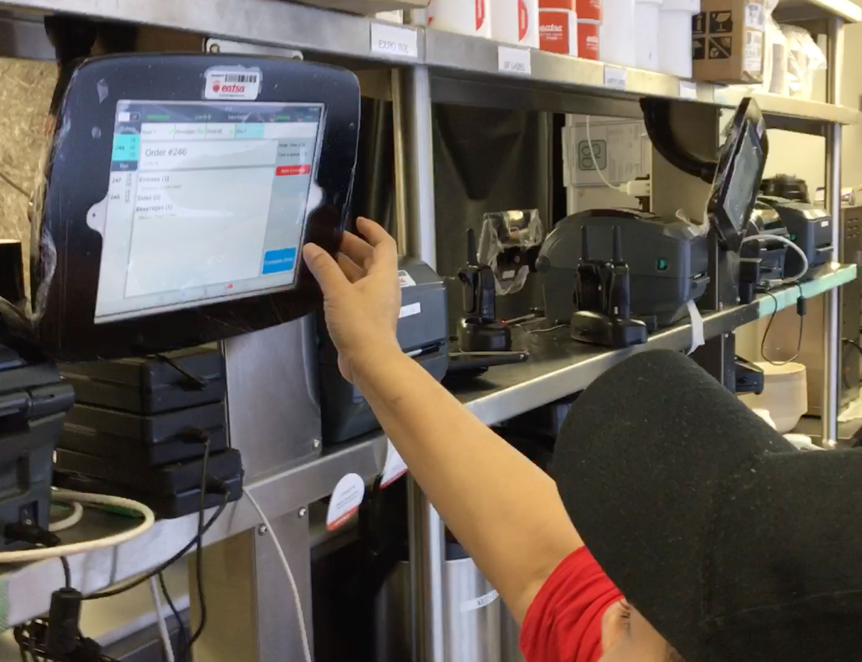
As the project's sole designer, I conducted onsite observations of employees during their shifts to assess the current interface's usability and gather insights on the user experience. I measured key metrics like user error rates, task completion times, and workflow interruptions.
To further understand their challenges, I not only interviewed kitchen staff but also personally executed numerous tasks to experience the workflow firsthand. I also carried out A/B testing and further interviews during the development phase.
The research revealed that staff often struggled with toggling between viewing order details onscreen and performing their primary tasks, such as cooking and collaborating with colleagues. This multitasking proved inefficient and significantly increased their cognitive load.
Kitchen workers interacting with the old interface were forced to remove gloves for accurate touch responses—a pain point observed during usability research.
Strategy & Approach
I hypothesized that in order to accelerate the order completion process, the application should support the worker's primary task while improving their ability to multitask. To strike the right balance, I investigated various methods for designing peripheral displays.
A peripheral display is a secondary screen or information panel designed to provide supplementary information without requiring the user's full attention. It's intended to be within the user's peripheral vision, allowing them to monitor supplementary information at a glance while focusing on a primary task. Designing the application following peripheral display principles significantly improved its ability to support multitasking.
I identified three key areas needing improvement to enhance the user experience:
- the way information is displayed
- physical interactions with the device
- the quality of audio notifications
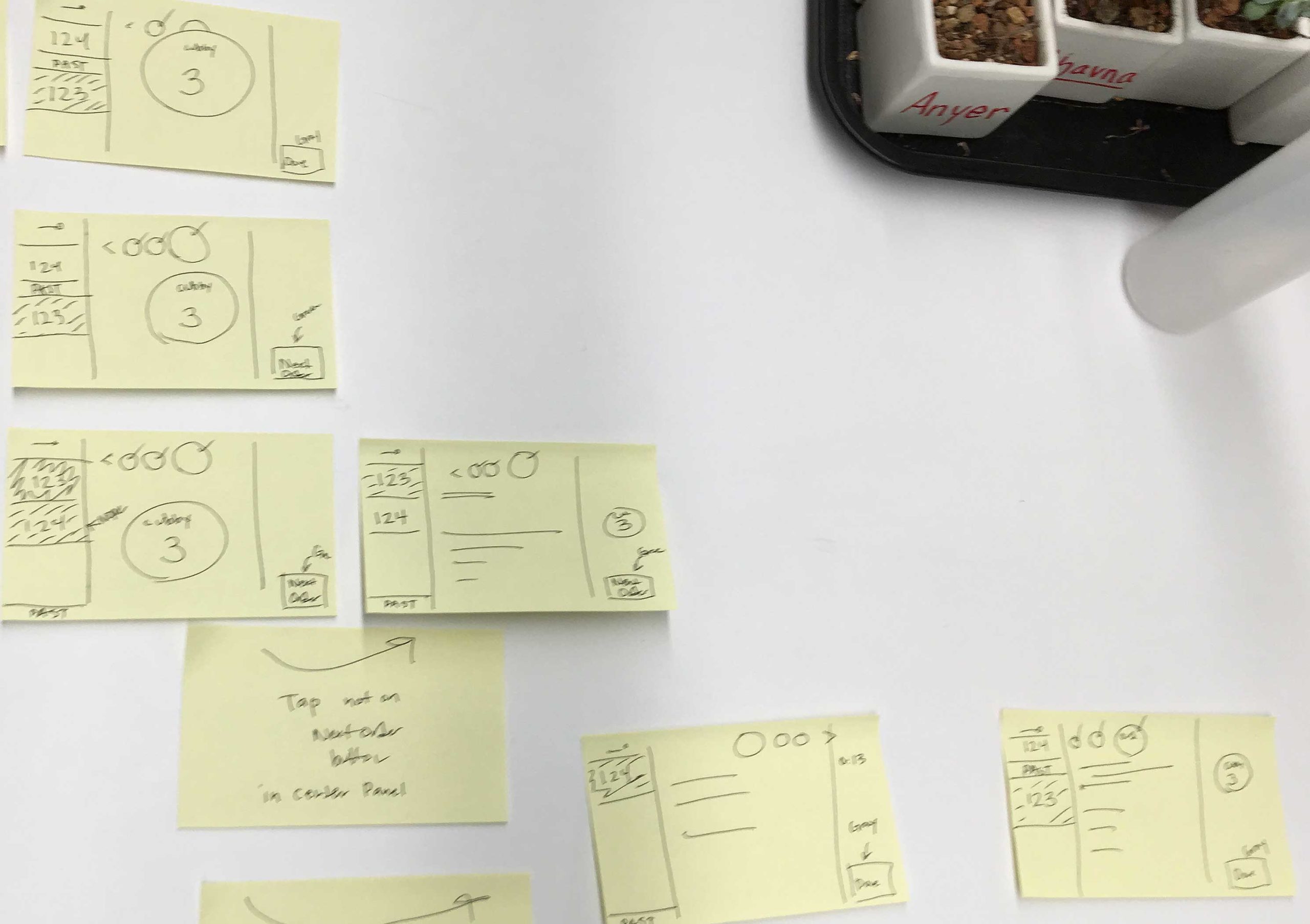
Rough sketches showcasing initial screen layout ideas.
UI Enhancements & Task Management
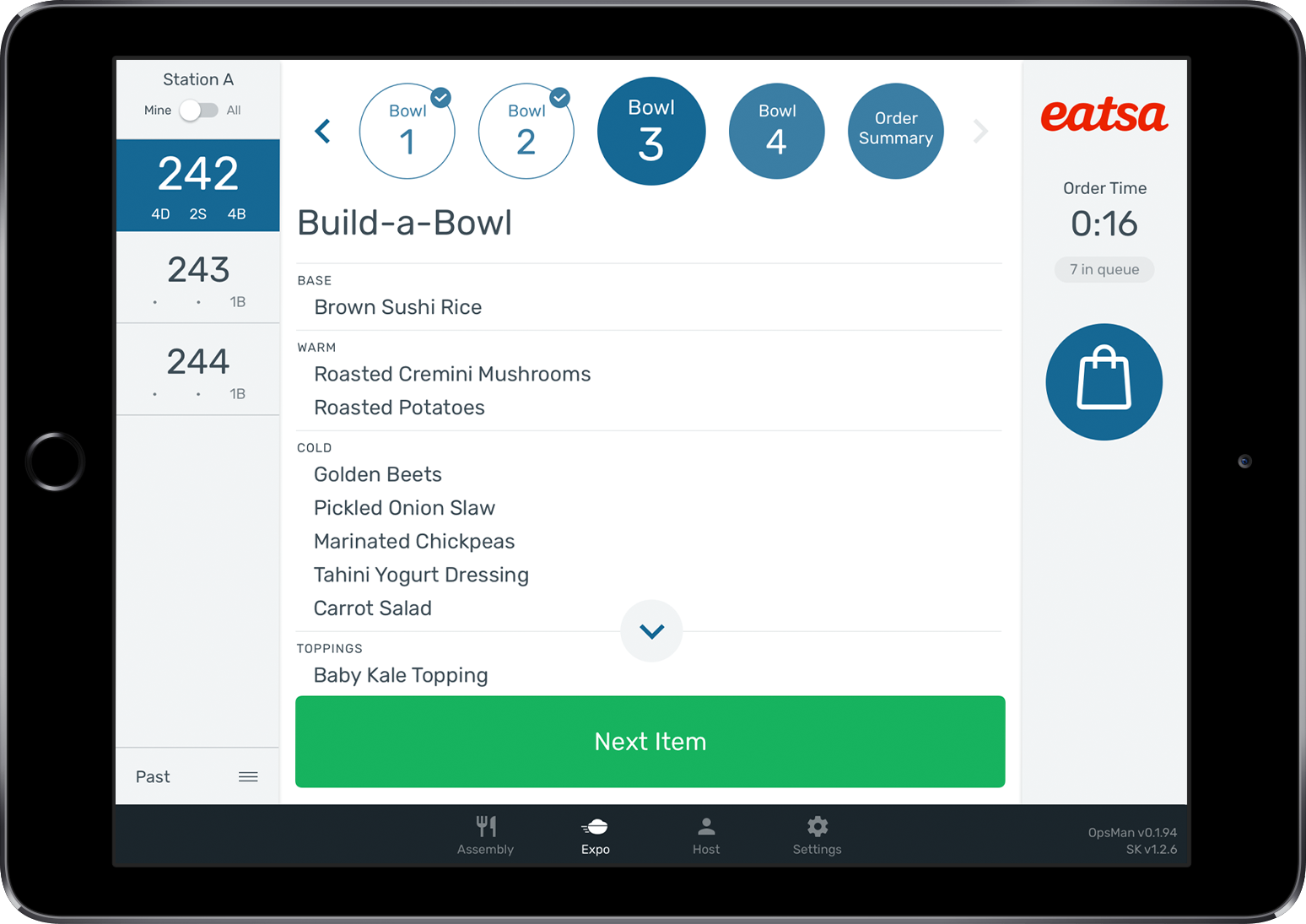
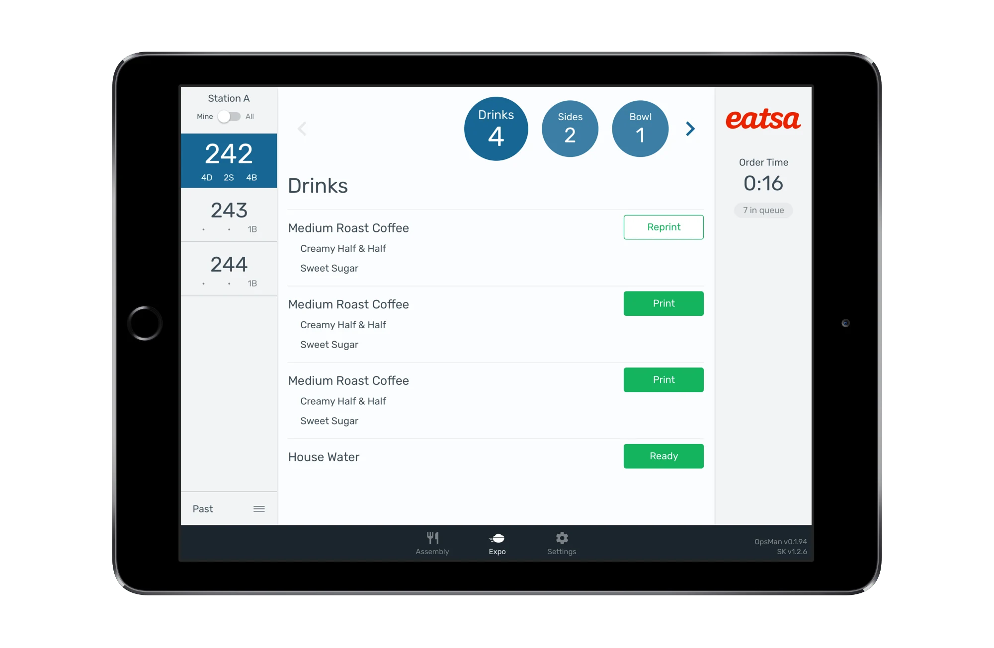
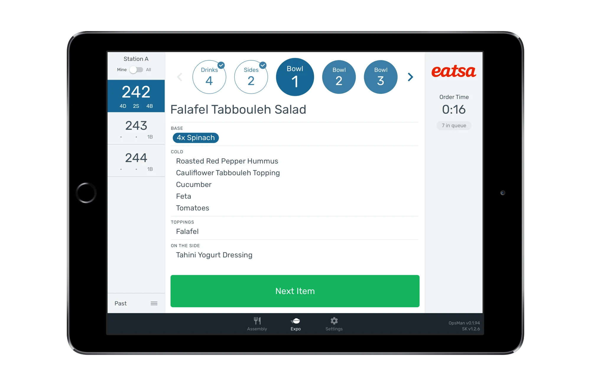
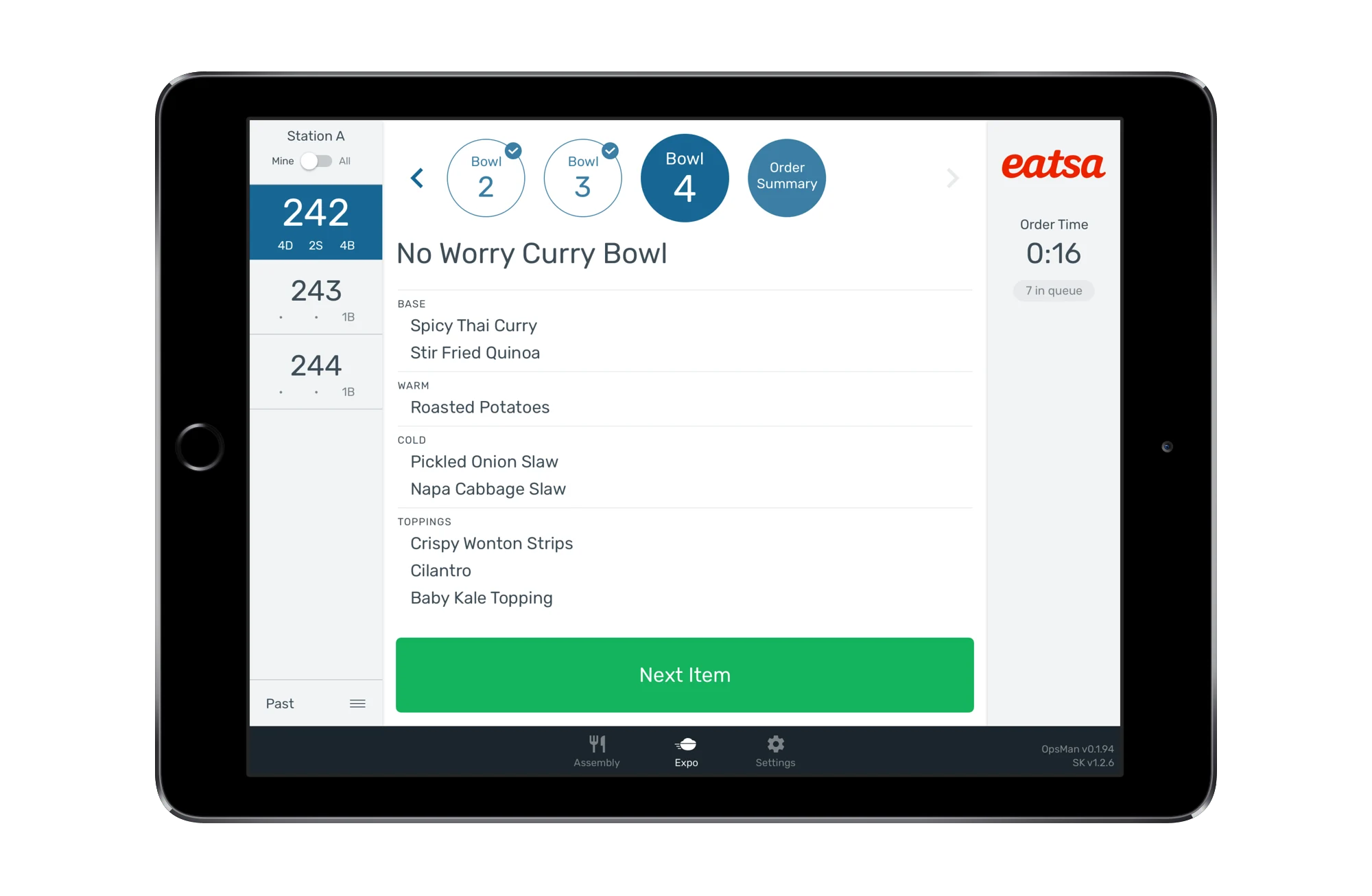
To tackle the problem of workers frequently interrupting their primary tasks to check information on the screen, I developed a glanceable user interface featuring clearly delineated content areas and consistent visual cues. This design empowers users to swiftly locate and process necessary information without disrupting their workflow.
Multitasking was improved by presenting information as needed. My approach emphasized providing users with clear indicators to track paused tasks, giving insights into optimal task-switching times, and adding features for easily resuming paused activities.
In the revamped interface, workers can easily identify and comprehend crucial information like:
- current task
- active step
- remaining steps
- status of completed or skipped steps
- information to anticipate upcoming steps
- pending tasks
- status of external hardware
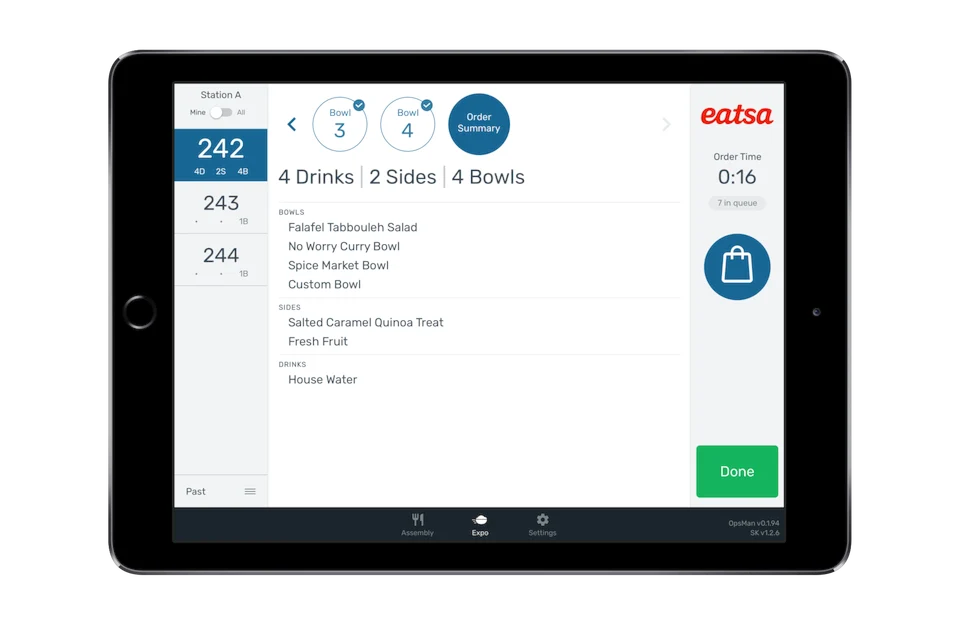
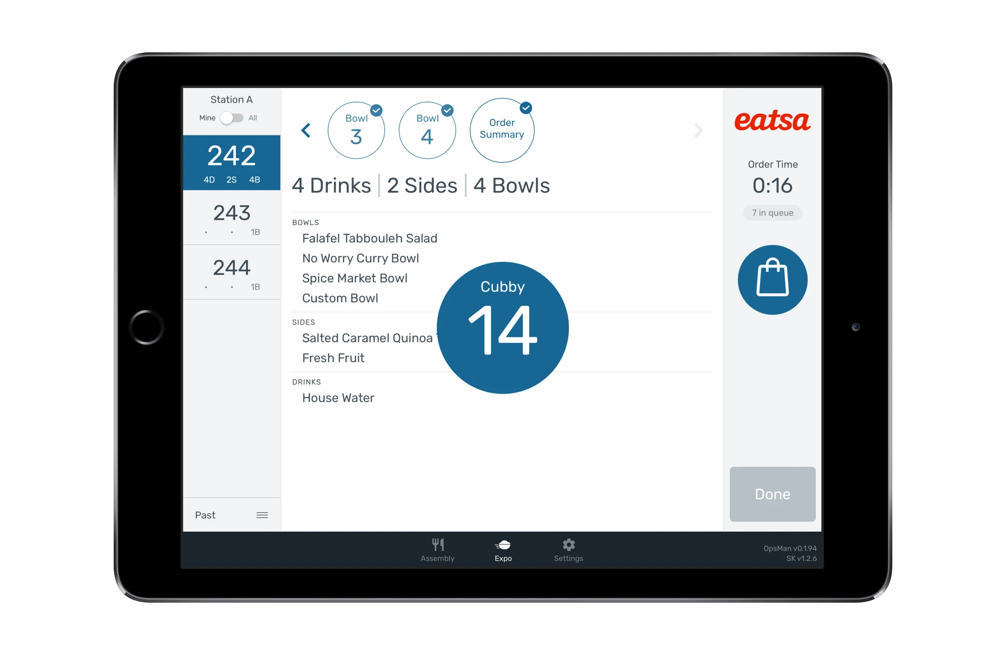
Redesigned interface showcasing streamlined content regions, intuitive color coding, and visual cues for efficient information processing.
Improving Touchscreen Usability
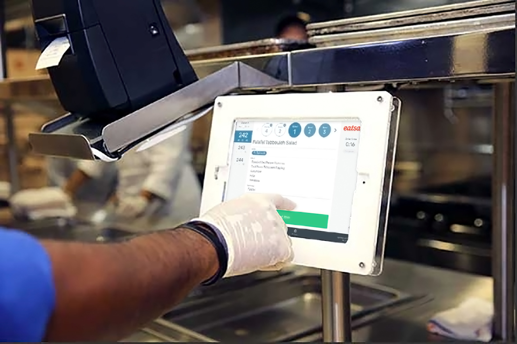
In commercial kitchens, where wearing latex gloves is mandatory, workers struggled with using the touch screen. They often had to tap multiple times for their input to register or remove their gloves for more effective interaction. Swipe gestures are unreliable, and small tap targets were frequently missed.
To address this issue, it was crucial to minimize or replace difficult interactions. The updated interface allows users to do everything with simple taps, eliminating the need for swipes. Tap areas and hitboxes are larger and strategically placed for easier access. Common action buttons are positioned near the screen's edge, while important task details are prominently displayed in the center.
These interface improvements allow workers to carry out tasks without needing to remove their gloves, saving significant time and streamlining operations. As a result, kitchen productivity increases with smoother task completion.
Designed for real-world use: Interface optimized for glove-friendly interactions and intuitive navigation.
Enhanced Audio Notifications
In busy commercial kitchens, workers rely on audio cues to stay updated on screen changes without disrupting their tasks. However, the old application's default system sounds, when amplified to cut through the noise of the kitchen, often proved disruptive to staff, leading many to mute the alerts. The challenge was to ensure these audio notifications remained clear amidst the kitchen environment without becoming intrusive.
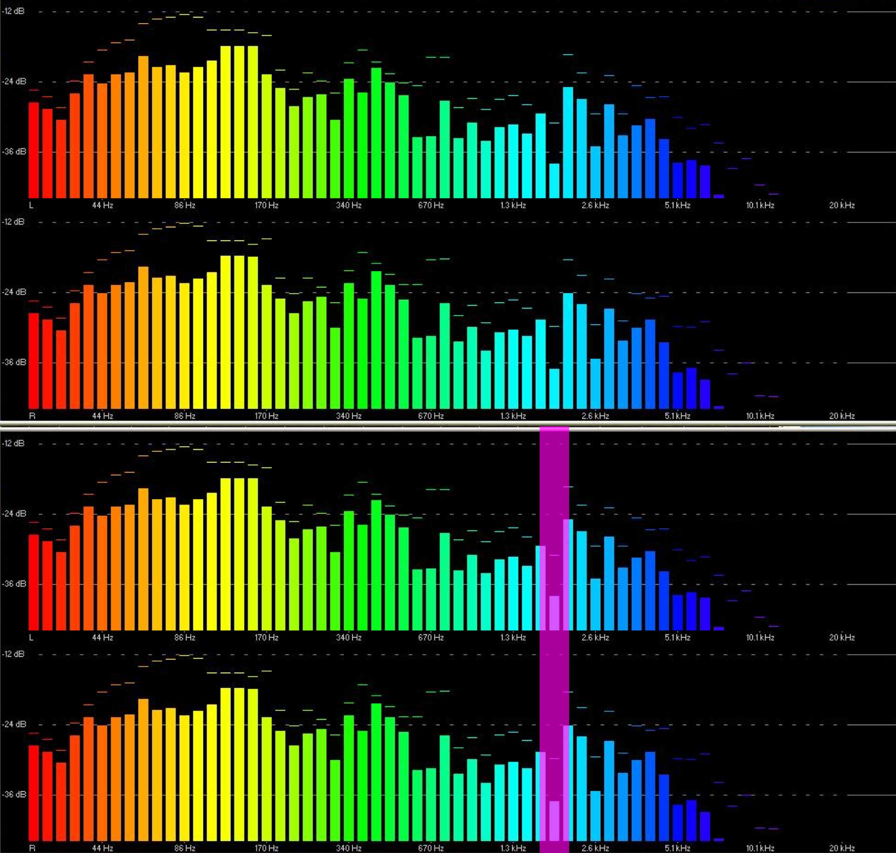
To address this, I conducted an analysis of the kitchen's background noise to identify sound frequencies less cluttered by ambient sounds. With this information, I created a set of distinct and pleasant audio cues that are easily discernible without being loud. As a result, the notifications are now audible at reasonable volumes, cutting through the background noise without drowning alerts from other kitchen appliances.
Audio spectrum analysis identifying the optimal frequency range for clear, non-intrusive kitchen notifications.
Balancing Branding and Consistency
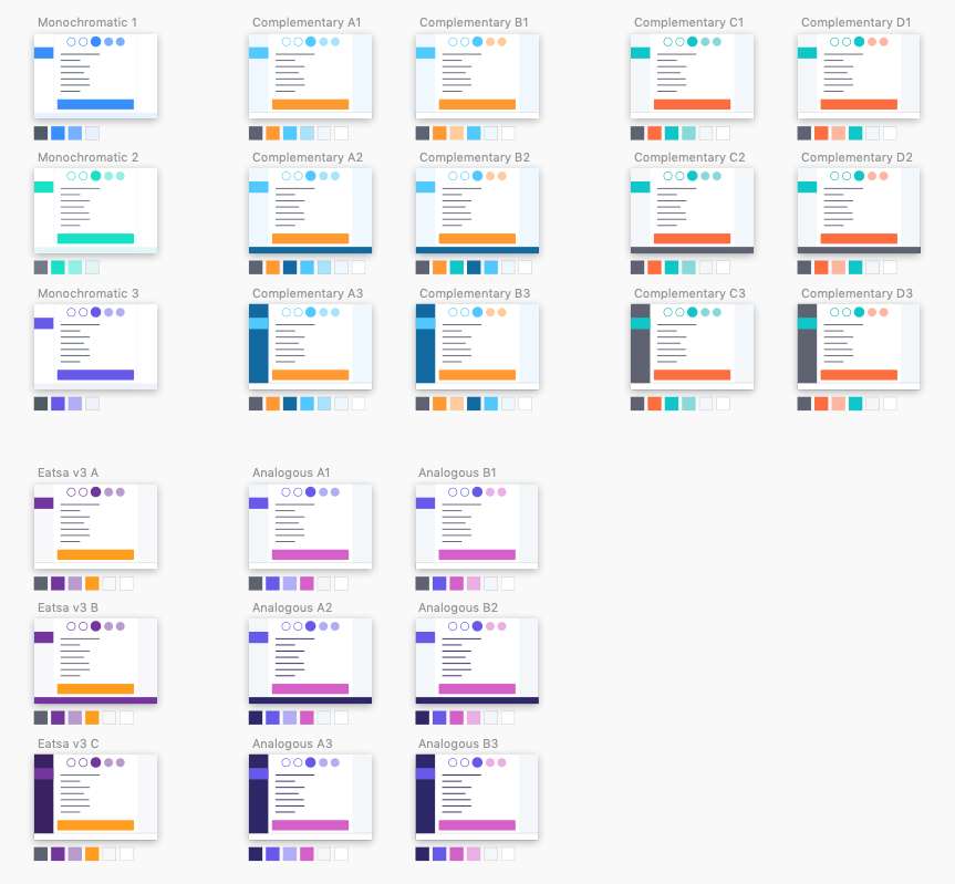
Clients have the option to customize the application's color scheme to match their brand. The challenge lay in creating a flexible theming system that ensures visual consistency and color cues, while also accommodating customization to align with each client's branding.
To strike this balance, I conducted extensive testing of various color combinations, determined optimal contrast levels, and established thematic bases that preserve color-coded features and visual cues.
A versatile theming system enables clients to tailor the application's color palette to their brand while retaining clear color-coded signals and visual guidelines. This approach provides a flexible solution that harmonizes brand identity with a consistent user experience.
Exploring color combination systems for theme customization.
Efficient Design System
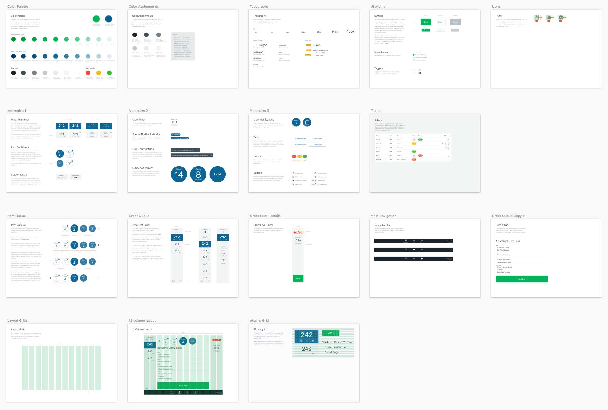
To ensure a consistent user experience and support scalable development, I've documented a comprehensive system of modular components. This system not only serves as a repository for reusable UI elements but also provides guidance for future design decisions, ensuring ongoing visual and functional consistency as the application evolves.
Implementing this modular system significantly streamlined both the design and development processes. By establishing a solid foundation with well-documented design principles, reusable components, and clear implementation guides, designers working on updates have a reliable framework to build upon, simplifying the design process and speeding up iterations. Similarly, developers benefit from clear guidelines that simplify coding and integration tasks. This cohesive approach enables the application to evolve efficiently, maintaining an exceptional user experience while seamlessly adapting to future growth.
Design documentation snapshot.
Improving multitasking efficiency through experience design.
